For this stage of my coursework we were asked to do textual analyse on 3 double page spreads and 3 contents pages. By this is means that I had to analyse 3 double page spreads and look at things like; colour scheme, image, subject names, quotes, stand first/ drop capitals, headlines and columns. Similarly, for the contents page I had to look at things like; colour schemes, mixes, categories, main images, masterheads and sub lines.

Content page
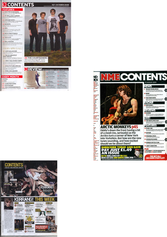
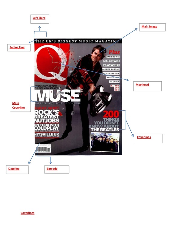
Colour Scheme: The colour scheme for Q magazine contents page matches the front cover of the magazine. Its red, white and black theme which makes the magazine stand out. The red shows the page numbers which is very important because it allows people to locate the page. Black makes the writing stand out and is very seeable against the white background which is a nice contrast. Keeping the same colour scheme through the magazine makes it look ncie and The use of the whte background allows the reader to be focused on the writing, whereas if it was a colourful background the target audience will get distracted. Also the colours being used can sure that the magazine is for mature readers.
Mix: This content page is a mix of photos, this attracts the target audience to read about a certain type of story and also makes the content page look interesting. Headings& textboxes this makes things clear and gives each space on the magazine a title so people know where to look for things.
Categories: Q magazine always has the same headings unless there is a new feature being added which will only be there the one time. This magazine has columns which is a neat and sensible layout making it easier to read. Text boxes are used to display a couple of words that are in bold and in capitals which will engage the reader.
Main Image: The main image on the content page is of a group of people. This is the main image because it is the biggest picture and is meant to be the main feature of the content page. The image does take up quite a lot of space on the content page so it grabs the attention of the target audience. In the main image there seems to be no detailed setting. The setting seems to be the four band members standing on a grassy hill and a blue sky background. The setiing can connote that the four band members are on the top of the world by standing on a hill, also shows that they are strong and maybe wealthy. It is a mixture of low-key lighting and high-key lighting. The picture of the four members of the band and the grass is high-key because it is not shadowy and you can see the detail of the picture and the buttom of the sky is low- key because it is shadowy and unclear for the target audience to see and recongnise. The costume that the band members are wearing are t-shirts and jeans. This shows a casual dress sense, they dont want to dress high. They may intend to make the audience feel connected to them and understand them more as people, also it could mean they want to relate to people. There is non verbal communication used in the picture such as facial expression and body language. In there facial expression you can see that they are straight forward, direct and nothing to worry about. Them looking directly straight at the camera shows that they want to be engaged with the target audience. Body language shown in the image shows that they are free and opened. They have their arms down showing that they are holding no secrets and want to be open towards the target audience.
Masthead: The main logo for Q magazine is featured on the contents page on the top left corner. It is not the big logo that is seen on the front cover of the magazinem it is a smaller image. The masthead is "Contents" which is in white against a black background, easy to see, very clear and stands out dude to the colour scheme.
Sub-Lines: The sublines used are smaller than the headline which gives additional information about what that particular story is about. They're both in the same font so that it matches. It is in black against a white background making the onformation noticable for the target audience.Some sub lines may include teasers which will get the target audience attention and will want to make them read it.
Colour Scheme: The colour scheme for NME is white black and red. The text is black writing on a plain white background, The subheadings are white and black background and there is some yellow colour used for advertising another magazine. Having a simple colour scheme will make the magazine look presentaable and adequet. A contents page with too much colour will then distract the reader and also make the writing hard to read if the colours are not used correctly. The colour scheme goes with the title of the magazine. This means that NME usually advertise rock bands and the colours red, black and white is stereotypical for a rock band to use, especially the colour black because it is dull and mysterious. Also, the colour scheme on the contents page goes wwih the colour on the front page and possibly through the magazine, it makes the magazine look organised.
Mix:. The content page is a mix of photos, headings and textboxes. the use of photos makes the content page look interesting, because if there is a picture used of a famous well-known person then effectively the target audience will be attracted. Also using a picture csn relate to one of the stories that will appear in the magazine. Headings are usedd to make the content page look clear and organised also it makes the target audience understand and read the text more clearly. In addition it also links in with the use of text boxes so the reader knows the title of each textbox, making things stand out and noticeable.
Categories: NME has a mix of columns and text boxes. NME magazine has one column of stories that will be featured in the mgazine. The columns are easy to follow and read, they're also set out in a clear mannered. NME has various text boxes with words and bold writing that will intrigue the reader. The use of doing this makes certains words stand out so that the reader will be directly drawn to that text. Also text boxes can also be used to advertise things that the reader may be interested in.
Main image: The main image used in this magazine is of a man holding a guitar and is singing using a microphone stand. The setting of the picture looks like the msn is doing a live concert at a arena. it doesnt seem to be in a recording studio because he seems to be sweating meaning that he has been singing to his fans all of his or his bands song. The setting of the image tells a story that the person actually loves doing what he does, you can see the passion by the way he is holding the guitar. The props used in the photograph is a guitar, microphoine stand and some drum equitment in the background. The guitar and the microphone show that he is all about music, he does music for a living. Also it represents the music that he likes to do "rock". This can also be sterotypical for rock bands or people to us guitars as a prop. The microphone shows that he is the lead singer or only singer of the band. The props used tell the story of the picture and from this people can easily assume what the picture or story is about. There is mixed lighting used in the picture of low-key and high- key. The instruments and the man have high-key lighting becausen you can see the the detail and is free from shadow. the lighting is not natrual maybe used from the stage lighting. Low-key lighting is seen in the background because you can't really see detail of what is actually there. As you can see it is shadowy and unclear. There is use of verbal communication in the image such as facial expression and body language. In his facial expression you can see that he is really passionate about what he does. Furthermore, his body language shows that he loves to entertain his audience and connect with them in several ways. In addition it shows that he wants his audience to be in one with him, he wants them to really understand him through his music. His music can tell a story to his audience relating to what he has went through or some problems that he may have had. The costume that he is wearing is just a black vest top. The colour of the black vest top shows that he is dark and mysterious, also could show that he is strong. Wearing a vest top shows off his arms and how strong he is, also can show how strong he is at his music.
Masthead: The name of the magazine is featured on the left corner of the content page and is next to the word contents. The word "contents" is in white writing on top of a black background. This is a good contrast because the text will be so much easier to read and very clear. The text used is sans serif , this is used because it is a straight forward type of text and also connote that the font is more modern.
sub-lines: The sublines give detail about what each article will be about and is usally shown as a smaller text so it doesn't take the attention away from the rest od the article. The purpose of the sublines is to inform the target audience briefly about what each article will be about. This give the target a sneak preview of what they will want to read. This can also be used as teaser because on some sublines they include interesting facts that wil encourage the reader to especially that article.
Colour Scheme: The colour scheme that is used in Kerrang magazine is black, yellow and white. This colour scheme works well because the title of the magazine itself has yellow and black on it. The colour scheme is quite dark and mysterious however it represents the type of magazine that kerrang is. The colour scheme is quite simple and the colours are interesting, the black could stand for dark, mysterious and cold- hearted, yellow could stand for joy and in there is joy within the magazine and the colour white can stand for peaceful. But little do we know that rock music is not peaceful, it is in fact the oppostie of that.
Mix: The contents page has a mixture of photos, headings and textboxes. The pictures are used to attract the target audience by showing a picture that is featured in the article. Without the image then the content page will look plain and boring. The picture is the key to the content page because the picture may be of a artist or band that the target audience will be interested in. Headings and textboxes allow the content page to look organised and clear, Without those then the magazine will look messy and the target audience will find it difficult to read and understand.
Catergories: Kerrang magazine has columns of 5 information on what will be featured on the magazine. The columns are used to make the content psge organised and make it easy for the target audience to read and follow. Also, there are textboxes which have bold and striking words which will grab the target audience attention.
Main image: The main image is of an artist surfing the crowd at one of his concerts. The setting of the picture is in a arena with lots of people in the background. The setting tells a story of young people being in a atmosphere together and an artist surfing the crowd, letting the audience get a feel of what he is. He must reakky trust his fans for him to jump in a crowd of people. The props being used is a microphone which connote that the artist is a singer seeing as he as the microphone is his hand whilst surfing the crowd. There is high-key lighting being used in the image because it is not shadowy or dull. It is bright and you can see the details shown in the image and the light also looks natrual. There is non verbal communication in the image by his body language because you cannot really see is face. The artist seems to be relaxed and free in the crowd. He really trusts his fans for him to let them carry him around, He wants his fans to have a special connection with him and feel what he can feel. The costume that is being showed ib the image is people in t-shirts and jeans.This shows that the people are dressed casual, looking free and relaxed and just want to have fun.
Masthead: The magazine name is featured on the buttom half of the content page. The word "content" is in yellow writing against a black background. This makes the word stand out seeing as the colour is yellow and it stands out on against the black background. The text font is sans sarif which is a sensible and straight forward text to use. It shows that the magazine is modern and that it wants it target audience to be able to read and see it.
Sublines: The sublines give specific details about some of the things featured in the magazine. Sublines are really important for a contents page because it allows the target audience to read about an article that may interest them. it also grabs the attention of the target audience making them alerted to the information given.
Double page spread

Colour Scheme: The colour scheme for this magazine is black writing on white background also for the rest if the double page spread is low key colour; really dull. The colour scheme also makes the double page look nice and simple. Most rapper magazines would have strippers, big cars, houses and other people; it is very stereotypical of them to do so. The colour scheme allows the target audience to focus on the story it self and the person it is about. It doesn't have bold, striking colours or imgaes which will distract the reader into looking at the images and not concentrating on the story. Also the colour scheme could set the theme for the image connoting thats its a simple dps and a simple image.
Image: The image is of a rapper named "Nas" and the image itself takes up one and a half pages. The image was taken in an old fashioned boxing gym, as you can see there are gym equitment such as; gym mats, weights and punching bags. The setting of the image can tell a story and relate to a former boxer "Rocky" who worked hard at what he did, and wanted the conquer the boxing world. This can connote that Nas is rying to reach his goal of being one of the best rappers of his generation. The windows connotates freedom, he is free to do what he wants to do, also the letters "NYC" symbolizes dream. Everyone goes to New York City to fufil their dreams and become something. As you can see one half of the rapper in very low-key and the other half is bright. This can mean hat the rapper is peaceful but also has a very dark and mysterious side to him. The props used in the image are; punching bags, weights and gym mats. This connotes that the rapper is fighting for his career, to show that he is the best at what he does. This may be against another rapper to show who is better in the rap world, this is very stereotypical of rapper to prove themselves to one another. The rapper is seen to be wearing a diamond watch and ring, silver chain and a white vest. The watch that the rapper is wearing connotes that he is wealthy and must be in the upper-class set to buy such an item. The ring that he is wearing connotates that he is rich and probably loyal to what he does. It shows the relationship between him and rap, there is a strong connection meaning that he loves what he does. The silver chain connotes again that he is wealthy and because of his status we see that his career is getting him somewhere in life. Also, the rapper has a sleeve of tattoos on his arm, it is stereotypical of most muscians especially rapper to have this done. This can link to his masculine side because he went through the pain of getting the sleeve done so it shows how brave and bold he is. Nas' body language shows that he is relaxed and calm, we see this because he seems to be sitting down on something. He lets the target audience feel welcomed by the way he is sitting down. It is a mid-shot which is directly looking at the audience, making them feel engaged in his story.
Subject Name: The subject name is located on the second page above the column of writing. It doesn't interfere with the image or writing so it will be easy to see. The writing is black on white background this way it is easier to read also the image links in with the subject name. This is because by looking at the image you will know straight away that the article is about the rapper Nas.
Quotes: The quote in this magazine is found at the buttom of the page by the picture. The quote that is being shown makes the article look real. it is a quote from the interview, this is a good thing because it tells us what the rapper is saying and how they feel. Instead of the interview being written as if things were made up, but having the quote there tells us what he actually said. He is a rapper that has took a break from the music work and is now back to do what he does best, rap.
Stand first/Drop capital: The drop capital is on the sencond half of the magazine. This is important because it makes the first letter of the article stand out and be bold. This is because it will let the target audience know where to start reading from. The font used is a stylish font, fancy letter to make it noticeable.
Headline: The headline is the quote about what the rapper Nas is saying. The headline links in with the article and he image because, when when we see the picture we straight away know that the article is about Nas. Also, when we read the quote we see we get a sense of what the article will be about.
Columns: The double pgae spread has just one column of writing. There's not that much writing because the picture does take up 3/4 of the page.
Double page spread
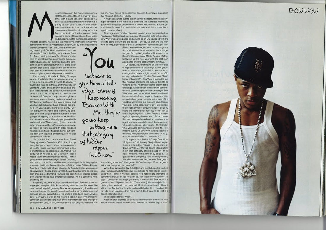
Colour Scheme: The colour scheme for the double spread page is just black and white. Black writing placed on a white background which is simple and plain. The colour scheme makes the double page spread page makes the article look peaceful. The reason that they did this is because Bow Wow is telling the magazine how he is growing up an becoming a teenager so he needs to start doing things that his fans can relate to.
Image: The double page spread has an large image of Bow Wow because the double page is about him an his music. It takes up the second page only and doesnt lay in the middle of the pages which will distract the target audience. The image is low key because the colours of the picture are not bright they're quite dark. The image can be split into half because on one side there is high key because you can see the tattoos on his arms and his skin tone. On the other side it is low key beause its black and we don't really see if he has tattoos on his other hand. We can see the shadow it creates on the vest top that he is wearing. He's wearing a hat, silver chain and a vest top. All of this is stereotypical of what all rappers will wear. The tattoos that he has can show he doesn't really care about society and he is just doing his own thing. It can also mean maturity, getting a tattoo can symbolise that he is growing up and becoming a man. The chain that he is wearing shows that he has enough money to afford it, from what he is doing is gaining him enough money.
Subject name: The subject name is located on the second page where the picture is and it says BOW WOW. It can easily be missed and no seeable. Also the fact that it is in black against a white background and is in capitals makes it kind of noticeable. It could be much more bigger so that the target audience can notice it as soon as they open the page. However the image does give us a hint about what the article will be about.
Quotes: The quote in this double page spread is placed in the middle of the columns. It has been specifically enlarged and in bold so that the target audience can see that this is what Bow Wow actually said from the interview. The quote can show how he is feeling about his music and how he is portrayed in the music industry. People will always see Bow Wow as lil' Bow Wow, but he is saying that he is now 18 and growing up, he doesn't want to push people that he is grown, he wants it to come natrually so they accept him for who he really is.
Stand-first/ Drop capital: This magazine has a drop capital which is the letter 'M'. The letter is bold and is very seeable for the target audience, letting them know where to read from.
Headline: The headline is the quote about what Bow Wow is saying. This quote is about the article and links in with it because it does repeat himself again in the article. This quote will draw the readers attention by just reading it because the target audience will want to know what he is tallking about and why he feels this way.
Columns: There are two columns used in the article which is even.
Double Page Spread

Colour Scheme: The colour scheme for this magazine is white, beige/brown and black. The colours beige and brown connote that the double page spread is mean to bring warmth to the readers. The colours used show a sigh of welcome, not holding anything back. Black writing on white background makes the text easier to read and understand. This is because the colours don't clash with each other. the colour scheme is pretty plain and simple so each part of the double page spread stands out.
Image: The image is of the group Black Eyed Peas, but as you can see they have faded out the rest of the members and specifically made Will.i.am the centre of attention.We can't really tell the setting of this photoshoot, but I think that the setting was just a plain background. The picture doesn't look like they took it all together. It looks like the picture has been photoshoped and cropped together to make the image look all in one. We can see this because Fergie is meant to be leaning on something or someone because she has her arm in the air and her body in tilted slantly. Also the picture shows us that she isn't leaning on Will.i.am's shoulder because her arm is behind him. The clothes that they are wearing co-ordinates with each other. This connotes that the group want to show that they get along with each other and shows the close bond that they share with each other. Their outfits show that they are a unique group and can't be compared to other groups. The clothes that they wear represents each one of them. The non verbal communication shown in this picture is the first one, standing with his legs closed and his hands held together and him looking foward could show that he may be mysterious, a very closed person that may be doesn't express his feelings that much. Fergie is showing in her body language that she is free, opened and relax. We see this because she is standing in a very relaxed position. She is directly looking at the camera showing a sign of respect to her target audience. This connotes that she doesn't feel stressed or anything and that she wants to be very direct with the target audience, not hiding anything from them. Will.i.am is standing with his legs opened and is standing forward from all of them shows that he is the leader of the group. Putting his hand on his head, saluting the target audience, this connotes a sign of respect that he has for his fans. Also could be saying thank you for all the support that the fans give. The last one through his body language is standing with his legs apart, which connotes that he is not hiding anything back. The movement that he is doing with his hands may connote that he has had enough of something or maybe he has been put under pressure too much. The image is high-key and we can see this because the colours are bright and we can see them.
Subject name: The subject name is 'Will he,won't he?' This is found on the first page f the double page spread and is written in big capital, so the reader van easily locate it. Another reason why this is in bold is so that the target audience can see the title and know what it is about. the title being bold makes it look eye-catching.
Quote: The quote is located on the second page of the double page spread and it is highlighted black with white writing. This is so that the readers can see the quote and understand that the interview is actually real. Having the quote there shows what the group is personally saying, making it reality.
Headline: The headline is the same as the subject name. The headline allows people to know what the article will be about. In this case the headline is 'Will he, Won't he.' This could mean many things for example they could be talking about will he, won't he leave the group. The headline also leaves the target audience wondering what the rest of the article will be about. This is seen as a teaser and will grab the target audiences attention.
Columns: The double page spread has two columns. The first column is the standfirst which is introducing the interview and the second column is the actual interview.
Stand-first: The stand-first is located underneath the headline where the target audience can read briefly about what the interview is about.


